Framing pictures, Photoshop tips & tools assistance.

moraym

Active Member
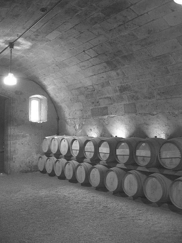
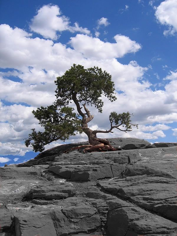
I am currently framing four pictures, two 8x10 black and white
scenery, and two 6x8 color of underwater reefs. I took all four pics,
had frames and matting fitted, now printing them at a local place for
framing for my townhome.
I'm pretty good with Photoshop, but wanted to get some advice on tips
and tricks to enhance the images...whether it's enhancing the color
and clarity of the reef shots, or enhancing the dramatic effect of the
B&W shots. Any help would be appreciated.
Thanks everyone.
 

npage

Member
That is a short question with a long answer. Every photo is different. How to enhance depends on the original photo. If you provide a sample I could give you a much better answer. But in the mean time here are some easy, down and dirty tricks.
Try Auto Levels, Auto Curves or Auto Color. You'd be surprised how well they work sometimes. If the effect is too much. Undo the adjustment, duplicate your background, reapply the adjustment to the copy layer and then lower the opacity of that layer until you find the right balance.
For black and white never just change the color mode to grayscale. It looks awful. Instead try making a Gradient Map adjustment layer and choose the black to white gradient. This produces much better tones.
Or try using the Channel Mixer Adjustment Layer. Check the Monochrome option and play around with the 3 slider values. I find a combined percentage between 80% to 120% works well for most images.
Also you may want to check out www.photoshoptv.com
They have some good tips and some links to other tutorials and video podcasts.
 

moraym

Active Member
Thanks for the tips, especially on the B&W pics. I've thrown the four pics in lower quality onto Photobucket, here are the examples: (thanks again)
Lighting in this one looks much better in B&W, nice effect, so this one is definitely going to B&W:
 

ruaround

Active Member
have you already made the adjustments that you desire???
i messed around with the first pic...
 

npage

Member
Sorry it took me a while to reply. Nice picts BTW! We just got 16" of snow dumped on us. Nothing slows things down like a blizzard.
Anyways, for the B&Ws I would definitely use the Channel Mixer technique I mentioned before. You have some great tones in those pictures and the Channel mixer will help maintain their contrast.
For the color ones I would bring up the contrast by increasing the shadow and highlight levels using a Levels or Curves adjustment layer. (Never use the Brightness & Contrast adjustment, its worthless) That should make the colors pop more.
For the clown fish picture I found selecting the fish and applying the Photo Filter adjustment layer, with the Orange setting and density to 100%. That helped make the fish stand out without over saturating them.
The turtle pict cleaned up after I raised the contrast by increasing the shadow and highlight. Then I selected the turtle only, inverted the selection to select the background and add the Reduce Noise filter.
Now don't feel stupid if you are unfamiliar with some of the terms or techniques I've mentioned. I've been doing Photoshop training for 10 years both privately and at the corporate and college level. I understand a lot of this doesn't come easy. So if you need any further explanations or help isolating the fish or turtle, please let me know. I love using and teaching people Photoshop. I'm more that happy to help.
Nick
 

moraym

Active Member
ruaround, liked the mod on the red rocks, hadn't thought of that. I just recently performed my first edit of a photo where I kept the girlfriend and I in color, and B&W for the rest of the background. So I'd be curious to know what technique you used. I just created a duplicate layer in B&W, put it under the color layer, and deleted out sections of the picture I wanted in B&W. But there's probably an easier and better quality method.
NPage, thanks for the advice. I printed and framed the pics Friday, as I had a holiday party on Saturday and wanted them up for it. For the color pics, I just used the 'Auto' adjustments, some I kept, some I didn't use. But I didn't get too much into them. For the black & white, I used the gradient mapping you suggested and it came out fairly well. I was especially happy with the B&W of the tree.
I couldn't get the Channel Mixer Adjustment Layer option you suggested to work out as planned. I selected it, checked the Monochrome option but what do I do with the sliders? When it first comes up blue is at 100% and everything else is 0%. I didn't understand the "combined" percentage too well. I set them all to 80%, all to 100%, all to 120%, and played with it a bit but couldn't come up with what you were shooting for I don't think.
I will play around with your suggestions you most recently made when I get some free time this week. I can always reprint the 8x10s for a few bucks and pop them in the frame.
Thanks for the advice, everything I know from Photoshop is trial and error...so I'm probably not using 99.5% of its features yet.
 

ruaround

Active Member
Originally Posted by MorayM
ruaround, liked the mod on the red rocks, hadn't thought of that. I just recently performed my first edit of a photo where I kept the girlfriend and I in color, and B&W for the rest of the background. So I'd be curious to know what technique you used. I just created a duplicate layer in B&W, put it under the color layer, and deleted out sections of the picture I wanted in B&W. But there's probably an easier and better quality method.
i used the magnetic lasso and actually cut the rock out... then opened a new file and pasted the rock into there... then converted it to B&W then cut it out of the new file and pasted into the original... i then touched up a couple areas that needed it...
 
Top